My role: Research, UX Design, Visual Design, Copywriting, Prototyping, QA
Release Date/Success Metrics
Release date: October 2023
The success metrics for the product design project were exceptionally positive, particularly regarding the app's timely release before Black Friday, Cyber Monday, and the holiday season. Initial projections aimed for an optimistic 10,000 downloads by the end of the year. However, the actual results surpassed expectations, with an impressive 25,000 downloads achieved by the end of Q4. This remarkable outcome not only demonstrated the app's popularity but also confirmed its success, as the majority of Catch users seamlessly transitioned to and continued utilizing the app instead of the web platform.
I'm open to discussing the valuable insights gained during the development of this project, including compromises and changes in direction. Let's connect for a more in-depth conversation.
About Catch
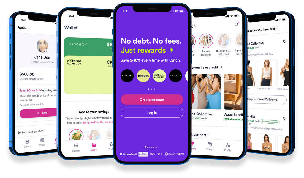
Catch is a payment method that allows you to pay for online purchases directly from your bank account or debit card and earn an average of 10% in store credit each time. Brands save on credit card fees, passing those savings to users as store credit, fostering repeat shopping.
User persona:

Problem Definition
User: Pamela faces several challenges when using Catch, impacting her overall shopping experience. Initially, she hesitated to share her information with a new payment processor she knew nothing about, especially since she couldn't find Catch in the app store.
Despite giving it a try and trusting it, Pamela doesn't enjoy the shopping experience. She misses out on deals and promotions due to the absence of reminders, and encounters friction in the web experience, particularly getting stuck on Shop Pay and being unable to find Catch as a payment method. These issues hinder Pamela's ability to shop seamlessly and confidently on Catch's platform.
Business: Catch faces limitations in engaging users effectively and providing a seamless and optimized user experience through web platforms alone. This results in lower user engagement, decreased brand loyalty, and missed opportunities for revenue generation. Additionally, the company may struggle to stay competitive in the market due to the absence of a mobile app, which has become a standard expectation among users in the digital landscape.
Discovery Phase Findings
These insights are derived from market research analysis and internal user interview findings.
Hypothesis
We hypothesize that the development of the Catch app will yield several positive outcomes:
Improved Accessibility and Convenience: Enabling seamless access to Catch's platform from smartphones will enhance user navigation and facilitate easy feature access.
Enhanced Sense of Trust and Security: The introduction of a dedicated mobile app will bolster user confidence in Catch's platform, ensuring secure storage of payment information.
Enhanced User Experience (UX): Simplifying the purchasing process and minimizing web-related friction, such as instances of getting stuck in the Shop Pay environment, will significantly enhance overall user experience on the Catch app.
Efficient Communication and Promotions: Timely push notifications on the Catch app will ensure users stay informed about deals, promotions, credit expirations, and important updates.
Enhanced Discovery of Brands and Products: The app will streamline the process of discovering other brands and products, providing users with access to a broader range of offerings and exclusive deals.
Current Design Pain Points
#1 Pain Point:
Difficulty visualizing all available credits.
Confusing sorting of credits.
Lack of highlighting for expiring credits.
Referral link buried under the fold.
#2 Pain Point:
Inadequate visibility into brand specifics or available products.
Absence of search functionality.
Limited customization.
#3 Pain Point:
Insufficient emphasis on the value proposition
Referral link buried below the fold
#4 Pain Point:
Insufficient guidance on navigating users away from the restrictive environment of Shop Pay.
Competitive Analysis/Wireframes
After conducting a competitive analysis of our competitors, a series of wireframes were developed to outline the flow and highlight key features to include, based on the offerings of our competitors.
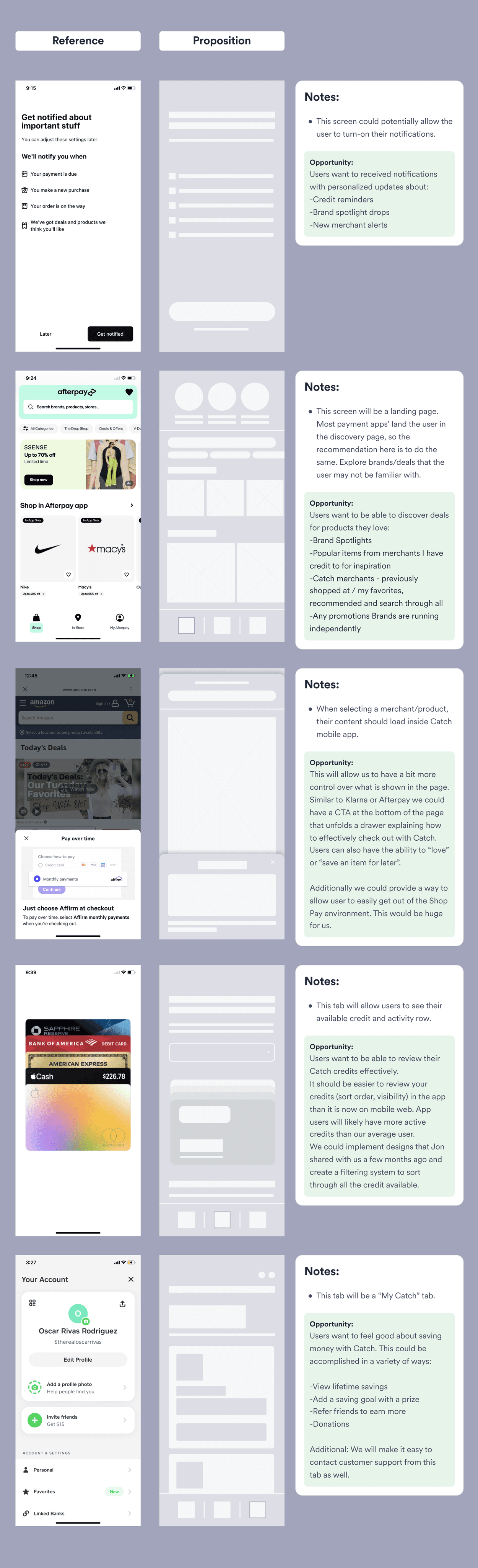
User Research Findings
Moderated user interviews were conducted to validate the proposed route and gather insights from existing Catch users. This method ensured alignment with their needs and revealed any existing concerns.
1-App Download
Users are deliberate when selecting which apps to download, considering choices carefully. They prioritize apps that provide significant added value, as they are cautious about their phone's storage capacity.
2- Product Images
Users respond more favorably to product images than generic brand images. The latter could be misleading, forcing the user to do more work to fully understand what the brand is about/what they sell.
3-Easy Log In
All users interviewed voiced their preference about logging in with their phone number versus email address. A couple mentioned one of the reasons they would like to have an App would be to make this process even more seamless (Face ID).
4- Categorization
Users were delighted about categories proposed and their expectations were match. “Newly added brands” seems to be a key category they would like to see added here. Other key categories: Brands where I can redeem my credit, favorites or even search.
5-Brand Details
User responded positively to the small brand description, price point and mission. Even when they are familiar with the brand, they think it is a good reminder and it does not impact the experience negatively in any way.
6- Product Recs
Users responded positively about the product rec feature and they believe it adds value to their experience. If they are familiar with the brand, they would like to see recs based on recent purchases.
Technical Limitations
Insights gathered from stakeholders, encompassing Product and Engineering, unveiled essential technical constraints that influenced the proposed design direction.
1-Animation Consideration
Consider animations sparingly, prioritizing them for future iterations like the walking phase to speed up the launch. As long as this does not impact the user experience.
2- Rec Challenges
Implementing product recommendations poses challenges due to the absence of an API with our partners, potentially necessitating manual updates and maintenance.
3-Pricing Complexity
Integrating original item pricing and item pricing with Catch adds complexity, especially when accounting for discounts not initially identified.
4- Face ID Efficiency
While Face ID offers convenience, its necessity is uncertain. Alternatively, prolonging user login sessions could reduce engineering workload.
5-Onboarding Preferences
Collecting user preferences during onboarding may not impact user experience for V01; careful consideration is needed to determine its necessity.
6- Launch Optimization
Implementing the Profile tab may require significant engineering effort. Consideration could be given to expediting the launch by replicating the web design.
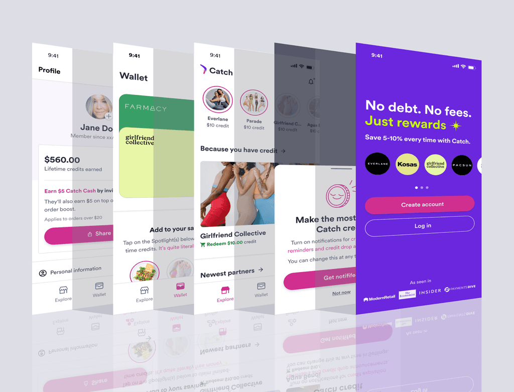
Proposed Final Look
After reviewing user feedback and technical constraints, stakeholders convened to determine the priorities and features to include in the MVP. Despite the potential manual effort involved, we concluded that offering visibility into the brand's products was crucial for potentially enhancing the user experience in V01.
Design Solution Rationale
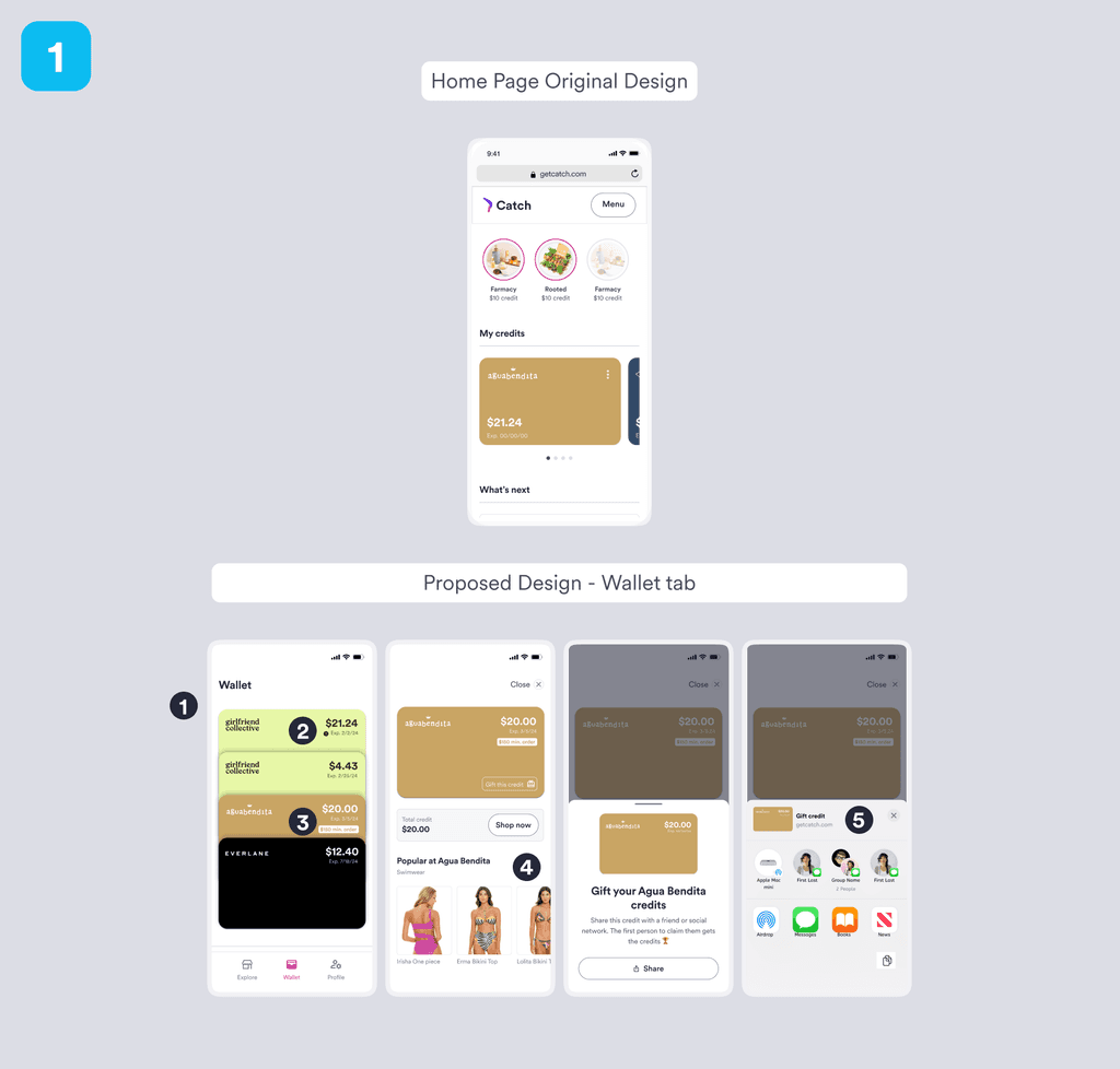
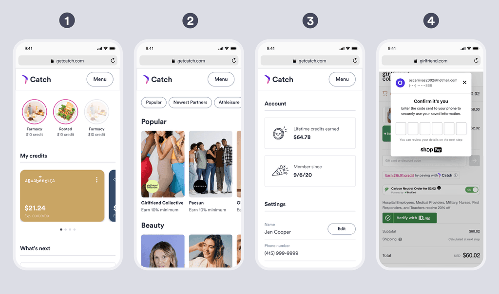
1-Improved Visualization and Sorting: The redesigned cards now stack credits vertically, enhancing visibility and comprehension. Credits are sorted by expiration date (first) and grouped by brand (second), providing a clear organizational structure.
2-Highlighting Expiring Credits: Credits nearing expiration feature an easily identifiable element, enabling users to take prompt action. This is complemented by push notifications alerting users of impending credit expiration.
3-Enhanced Spotting of Restrictions: The redesigned interface facilitates the effortless identification of potential restrictions within available credits, ensuring users are aware of any limitations.
4-Detailed Brand View: Users gain insights into brand offerings through images of bestselling products and informative copy, enabling a comprehensive understanding of each brand.
5-Simplified Gifting Process: Users can effortlessly share their unwanted credits using an iOS component, eliminating the need for manual copy and paste actions.
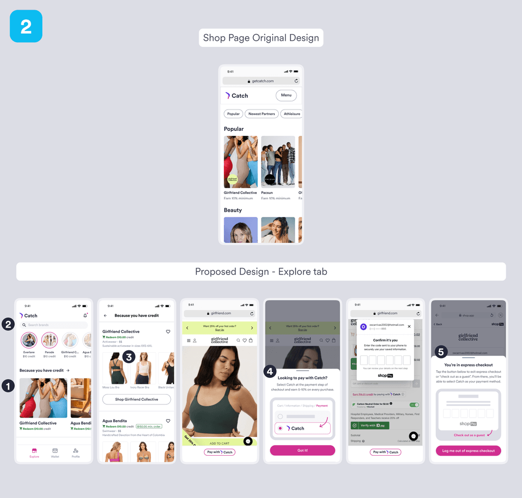
1-Streamlined Collaboration: The revamped structure prioritizes categories based on user preferences, including places with outstanding credit, newly added brands, personalized recommendations based on past purchases, favorites, and more.
2-Enhanced Brand Search: Users can easily search for specific brands, whether partner or affiliated, without the need to endlessly scroll through the all brand category or apply filters, improving search efficiency.
3-Direct Access to Product Pages: Users can navigate directly to product pages or explore entire brands, enhancing their browsing experience and facilitating quicker access to desired items.
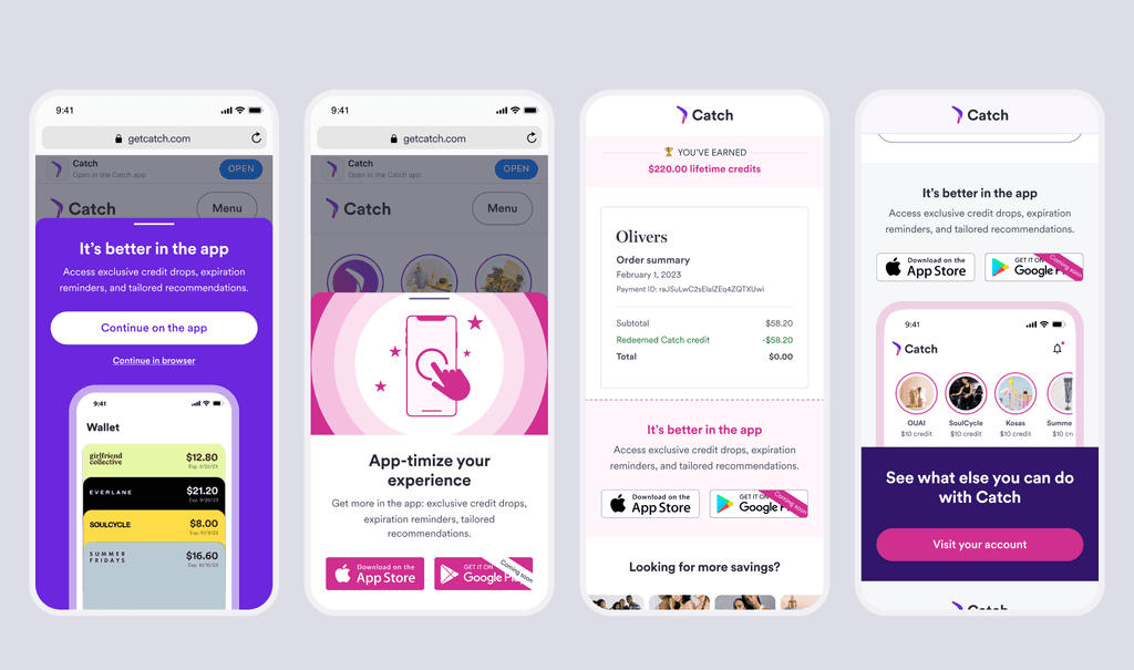
4-Improved Wayfinding: A dedicated wayfinding widget assists users unfamiliar with Catch, guiding them through checkout and facilitating the discovery of Catch as a payment method, ensuring a smoother navigation experience.
5-Successful Localization Integration: Users can seamlessly exit the intrusive Shop Pay experience with a single click, improving navigation flow. Automated detection identifies users stuck in the process, guiding them back to Catch for a hassle-free experience.
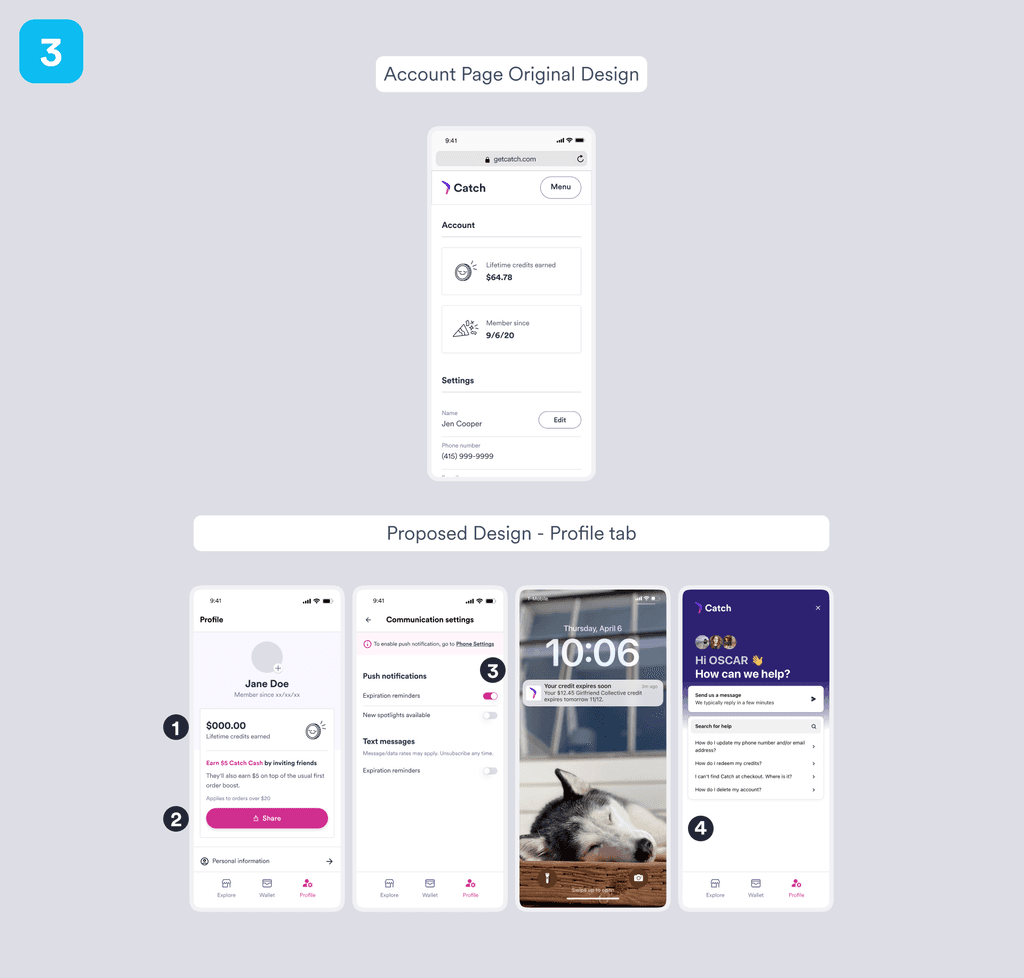
1-Enhanced Value Proposition: The new design prominently showcases Catch's value proposition, enabling users to visualize the total amount saved by utilizing Catch. This fosters a clear understanding of the app's benefits and value.
2-Streamlined Referral Process: Recognizing the potential for users to refer the app to friends upon understanding its value, the redesign prioritizes the referral link for easy access and sharing, ensuring it is readily available.
3-Customizable Push Notifications: Users now have the option to customize notifications within their profile, even if they didn't set them up during onboarding. This feature allows users to receive alerts when credits are about to expire and other relevant updates, maximizing their experience with Catch.
4-Improved Support Accessibility: Users can conveniently access support directly from within the app, providing quick assistance and guidance whenever needed, enhancing overall user satisfaction and experience.
GTM
A series of marketing initiatives were strategically devised and executed to announce the release and highlight the significantly enhanced user experience offered by the app compared to its web counterpart. These efforts were spread across various channels to maximize visibility.